|
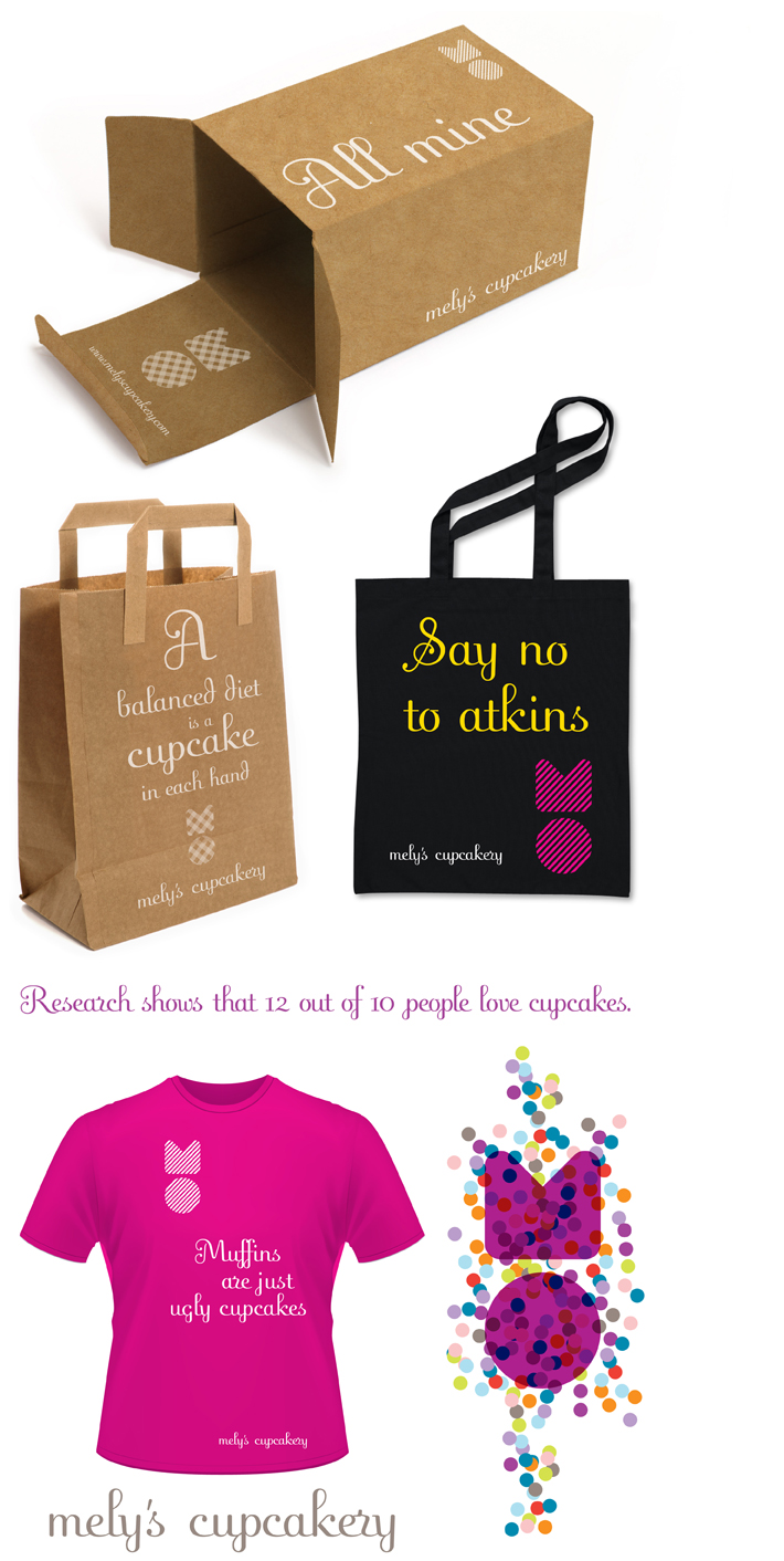
Mely’s Cupcakery, as the name implies, bake and sell cupcakes, macaroons and other such treats at markets and in cafes around Ireland. Owner Michelle Lambeth approached Motif to create their identity, packaging and promotional items.
The Mely’s Cupcakery brand is, as it should be, playful. The graphic device is strong and simple – ‘M’ for Mely and a circle representing a cupcake. We used this shape in a flexible manner throughout, avoiding regimentation in the styling. The graphic device can be used with different colours, overlays and imagery, keeping the brand fresh and fun but also instantly recognizable. Subtly ornate typography adds to the quirky personality of the brand. Tongue in cheek copy helps to create a sense of personality.
Cupcakes are about colour and craft, different flavours for different people. This is central to the design approach. The freedom in the work allows the Mely’s to stay fresh and to differentiate themselves from their competition. We are currently working on the Mely’s website for launch later in 2011.
|